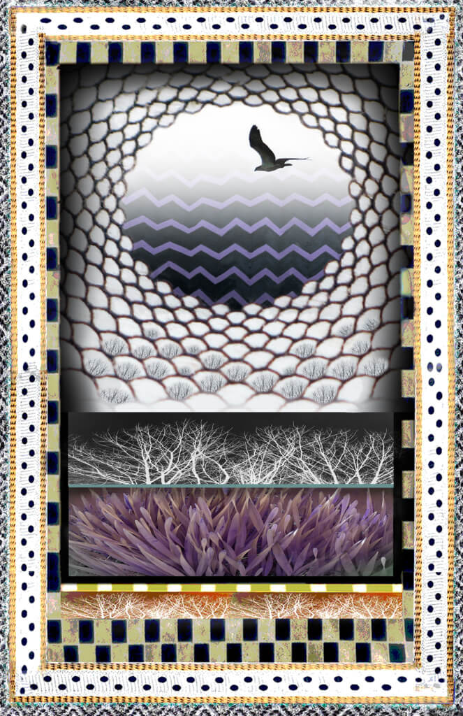
“This is Me, it’s like a part of me. I can’t just get rid of it. These graphics are my branding,” I told the Ithaca College student who was writing a critical evaluation of my website for his final project. But I knew the distracting purple and black zigzags had to go. It was the Me from four years ago, when I was clinging to my past artwork because I no longer knew who I was or what I was capable of. Thinking I’d never do art again, a year after my daughter died, I’d grabbed graphics from decades earlier to design my site. I’d filled every corner of my online home, as if I could pad and protect my new life.
“Cluttered …crowded … crazy patterns … Unclear what the purpose is,” was written in the student’s report. Many of his classmates had voted in agreement, “The site doesn’t look trustworthy.” A suffocating heaviness enveloped me. Like grief. And I wondered how I had failed, and why my readers wouldn’t trust me. After all, I had emptied my heart onto the blog posts. Each week for four years I’d dug deep into my gut to extract the truth about losing a loved one, and planted it on the pages. What else could I possibly expose in order to be “trustworthy?” I decided to tear down and whitewash the whole site.
Days later, I learned that trustworthiness referred to the credibility of the website, and the safeguards utilized to secure the site from scammers and malicious hackers.
“We’re updating your secure connection, and getting you the certification sticker,” Bob, my webmaster at Ameriweb Hosting, assured me, when I called, in tears. But by then, my mind was made up. It was time to clean up and clear it out.
So please excuse the mess on my website the next few weeks as I peel away the old distracting layers of design, and Bob adds layers of protection. I’m lightening up and simplifying our looks. There’s room to spread out now. More space. It’s secure. Finally, I can breathe again. I can fly.